Open Source Version
Apache License 2.0
Free for personal and commercial use
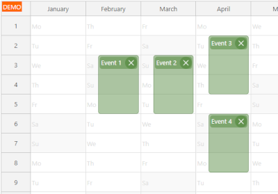
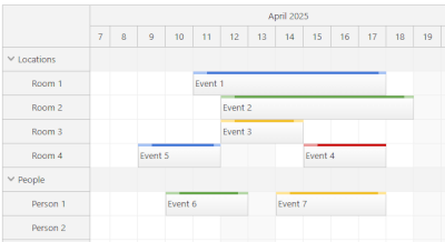 Scheduler
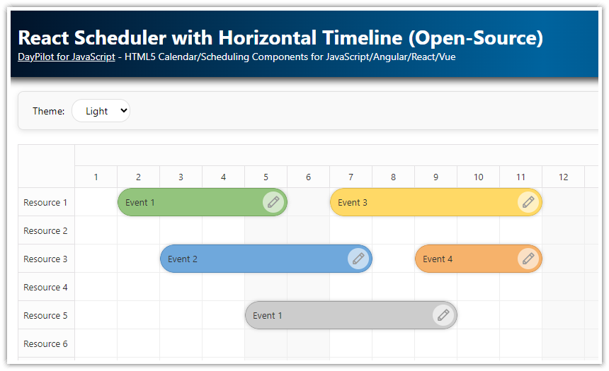
A horizontal timeline that shows resources as rows, with support for large data sets.
LITE
PRO
Scheduler
A horizontal timeline that shows resources as rows, with support for large data sets.
LITE
PRO
Lite version includes: Drag-and-drop CSS themes Progressive rendering Custom timescale Next.js support Snap to grid Event icons Custom event drag handles Touch devices Localization Undo/redo XSS protection
Pro version includes: All Lite features Non-continuous timeline Frozen rows PDF export Image export PDF export Excel export Hierarchy of resources Dynamic event loading during scrolling Dependency links Milestones Mass drag-and-drop operations Row header columns Dragging events from and to an external source Bubble popover Zoom Split resources Disabled cells Holidays Skipping non-business hours Hiding non-business hours Row header width auto-fit Keyboard navigation Drag-and-drop row moving Inline editing Concurrent event groups Row sorting Row filtering JSX in event, cells and headers Overlap prevention Infinite scrolling Event versions Event phases Joint events are always moved and resized together Resource utilization summary Crosshair
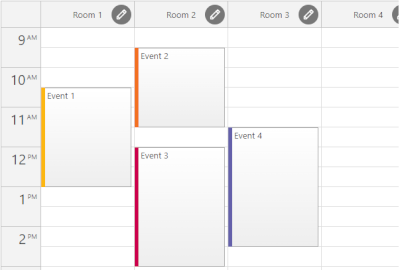 Resource Calendar
A vertical timeline that shows resources as columns.
LITE
PRO
Resource Calendar
A vertical timeline that shows resources as columns.
LITE
PRO
Lite version includes: Drag-and-drop CSS themes Next.js support Snap to grid Event icons Custom event content and styling Undo/redo Localization
Pro version includes: All Lite features Drag-and-drop column moving and resizing Column hierarchy Column filtering Column header height auto-fit Custom timescale Progressive rendering PDF export Image export Bubble popover Zoom Disabled cells Holidays Touch devices
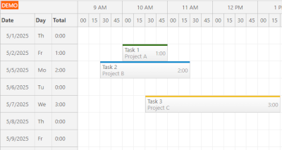
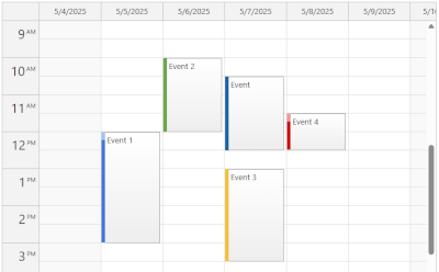 Daily / Weekly Calendar
An interactive day & week view with drag-and-drop and customizable cell duration.
LITE
PRO
Daily / Weekly Calendar
An interactive day & week view with drag-and-drop and customizable cell duration.
LITE
PRO
Lite version includes: Customizable cell duration Drag-and-drop Next.js support Snap to grid Customizable event, cell, and header content Event icons Custom event drag handles Localization Configurable number of days Context menu Business hours Holidays Undo/redo CSS themes TypeScript
Pro version includes: All Lite features Progressive rendering High number columns with fixed width All-day events Touch devices Bubble popover Zoom Disabled cells Column header height auto-fit Inline editing JSX in events, cells and headers Image export PDF export RTL support AutoScroll Crosshair
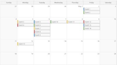 Monthly Calendar
A month grid that displays days as cells.
LITE
PRO
Monthly Calendar
A month grid that displays days as cells.
LITE
PRO
Lite version includes: Customizable cell duration Events spanning multiple days Drag-and-drop event moving and resizing Next.js support Snap to grid Event icons Adjustable event height Customizable event content and CSS Built-in or custom delete icons Localization Context menu Event tooltip Business days Holidays CSS themes Undo/redo TypeScript
Pro version includes: All Lite features Touch devices Bubble popover Disabled cells Inline editing JSX in events and cells Image export PDF export RTL support AutoScroll Custom event drag handles Full month or specified number of weeks Maximum number of events per cell Cell stacking mode
 Yearly Calendar
A yearly calendar that shows months as columns.
PRO
Yearly Calendar
A yearly calendar that shows months as columns.
PRO
Pro version includes: Drag-and-drop Event spanning multiple days or months CSS themes Next.js support Snap to grid Event icons Custom event drag handles Touch devices Localization Progressive rendering Fixed or automatic column width PDF export Image export Bubble popover Zoom Undo/redo Disabled cells Holidays
 Timesheet
A timesheet view with one day per row and up to 24 hours on the horizonal axis.
PRO
Timesheet
A timesheet view with one day per row and up to 24 hours on the horizonal axis.
PRO
Horizontal timeline tailored for employee hours, project billing and utilization tracking.
Pro version includes: Drag-and-drop CSS themes Next.js support Snap to grid Event icons Custom event drag handles Touch devices Localization Progressive rendering PDF export Image export Excel export Bubble popover Zoom Undo/redo Disabled cells Holidays Hiding non-business hours Row header width auto-fit Keyboard navigation Inline editing JSX in event, cells and headers Crosshair Row header columns TypeScript
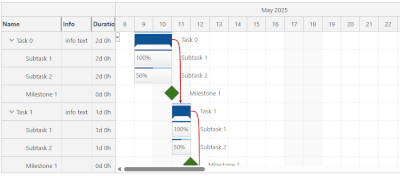 Gantt Chart
A project timeline with tasks, links, and milestones.
PRO
Gantt Chart
A project timeline with tasks, links, and milestones.
PRO
Project timeline with tasks, links, milestones, and drag-and-drop support.
Pro version includes: Drag-and-drop CSS themes Next.js support Snap to grid Task icons Milestones Task groups Touch devices Localization Progressive rendering PDF export Image export Excel export Bubble popover Disabled cells Drag and drop between two Gantt charts Zoom Undo/redo Holidays Hiding non-business hours Row header width auto-fit Inline editing JSX in tasks, cells and headers Crosshair Task header columns Task dependency highlighting using links (Start-to-Start, Start-to-Finish, Finish-to-Start, Finish-to-Finish) Task progress bar Large data sets Non-linear timeline Context menu Custom time scale (minutes, hours, days, weeks, months, years) Customizable task content (HTML, active areas) TypeScript
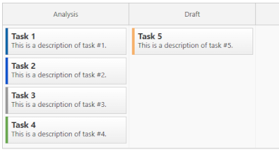 Kanban Board
A column-based task board with optional horizontal swim-lanes.
PRO
Kanban Board
A column-based task board with optional horizontal swim-lanes.
PRO
Pro version includes: Drag-and-drop CSS themes Next.js support Snap to grid Card icons Touch devices Localization Progressive rendering Row header columns Large number of columns with fixed width Bubble popover Row header width auto-fit Keyboard navigation Inline editing JSX in cards, cells and headers Crosshair Card swim-lanes Card customization (HTML, icons, active areas) Context menu Bubble popover Card color-coding TypeScript External drag and drop Drag and drop swimlane moving


Build a custom component configuration.
Generate a React or Next.js project.

This tutorial shows how to create a complex calendar component that displays integrated daily, weekly and monthly calendars in React.
.png)
A lightweight, open-source React Scheduler component with a horizontal timeline, drag-and-drop support, customizable appearance, and smooth performance for large data sets.

React application that displays a weekly event calendar using an open-source DayPilot React calendar component. Includes a date picker for changing the visible week. The calendar/scheduler appearance is customized using CSS.
React application that displays a monthly event calendar. Calendar events use custom background to show an event type. A context menu allows deleting events and changing color.

How to use the open-source React resource calendar component to create a scheduling application for multiple groups of resources (locations, people, tools). Add a date picker and next/previous buttons that let users change the visible date.

How to activate external items so they can be dragged to the React Scheduler component.

How to export the current React Scheduler view to a multi-page PDF document with a specified number of rows per page.

How to create dynamic calendars and schedulers with a vertical timeline, customizable time cells, and resource display in React.

How to display milestones in the React Scheduler component. You can use custom shapes, icons, colors and connect the milestones using links.

How to add a zoom feature to the React Scheduler timeline. You can change the zoom level (and timeline resolution) using a "range" control and "zoom in" and "zoom out" buttons.

Links can be used to display relationships between tasks in the React Scheduler UI component. Learn about the most common use cases and configuration options.

The React Scheduler component can record all drag and drop actions and allow unlimited undo/redo. See how to add undo/redo buttons and display the full history.

How to build a visual schedule in Next.js that displays the planned version of a task above its actual version. This makes it easy to compare durations and track deviations from the original plan.
 DayPilot
 />
/>